Use a custom WordPress block to enhance the design of your page and display compelling content. Not every page needs a custom block, but these can be used on key pages on your site. Blocks should be used in moderation on any particular page. Incorrect use of these custom blocks may result in losing access to edit your site.
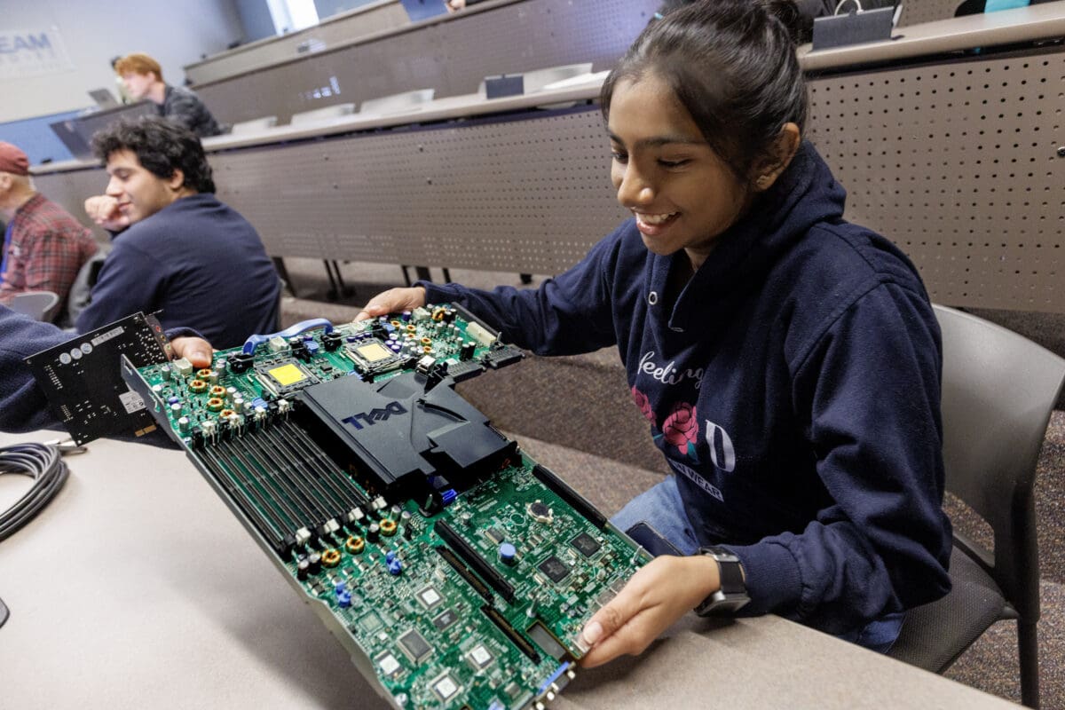
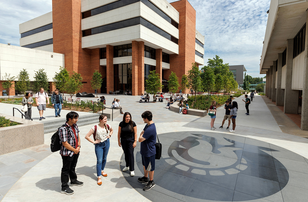
Images used in blocks should be sized at 800 pixels wide by 600 pixels tall.
Promo Block
Use this Promo Block to promote brief information, such as a scholarship or research opportunity. Display with or without an image. This block can have one or two buttons, or none. This block can also be maroon or ocean.
Heading: Promo Block
Promote brief information here. Display with or without an image. In the settings, choose the color to be maroon or ocean.

Stats Row
This block is a row of stats with icons. No links. The colors of the icons cannot be changed. There are several icon options. Use this for dates or important stats about your program.
Links Icons Row
This block is a row of icons with links. The colors of the icons cannot be changed. There are several icon options. Use this for key links.
Image Grid
This block displays small images with headings and links for each card. Four cards can be displayed on one row. The Image Grid block will have a light gray background that cannot be changed. Recommended image size: 800×600.
Heading: Image Grid
You can include brief subtext here if needed. Four cards fit on one row. Do not display more than eight cards at a time.
Split Content – Image
The Split Content – Image block lets you display text content with an image. Use with or without buttons. This spans the full width of the page. The colors cannot be changed.
Heading: Split Content – Image
Include some brief paragraph text. You can include one or two buttons, or no buttons. The image is added in the Settings of this block. The image should be 800 pixels wide by 600 pixels tall.
Call to Action Second Call to Action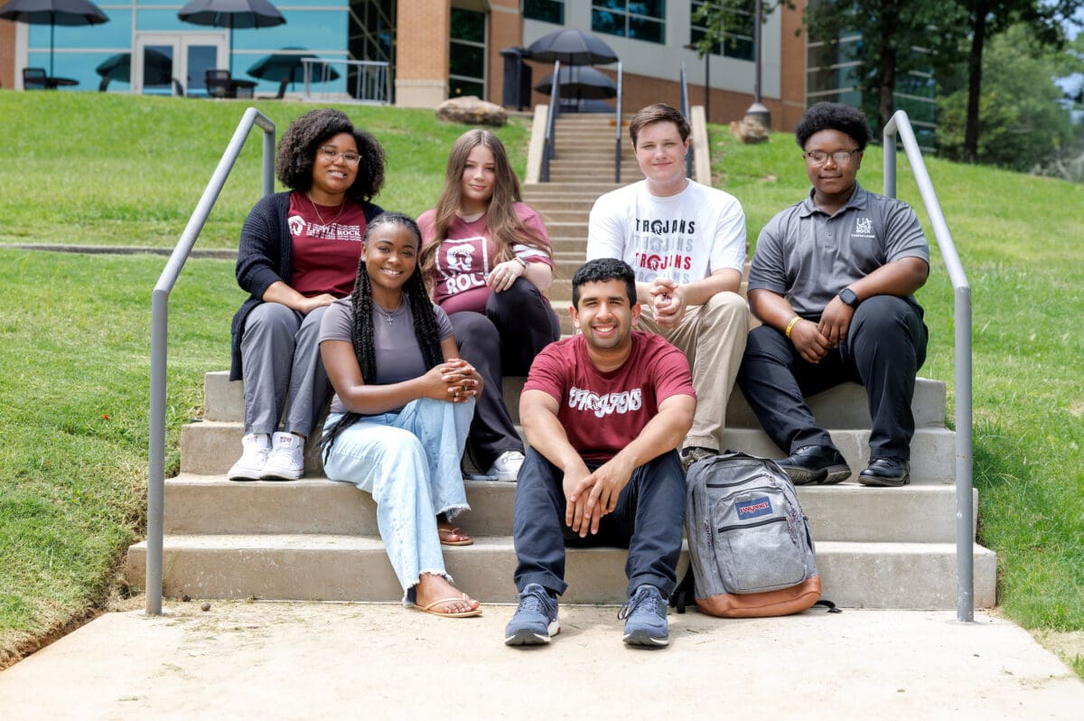
Split Content – Stat
The Split Content – Stat block is used to display brief text content and a compelling stat about your program or department. Use with or without buttons. This spans the full width of the page. The colors cannot be changed.
Heading: Split Content – Stat
Include some brief paragraph text. You can include one or two buttons, or no buttons. A background image can be added to go behind the number, but is not required.
Call to Action Call to ActionSide-by-Side Text
This block can display heading text with a text callout. Use this block to highlight and draw attention to important information. This should not be used for simple paragraph text, but for something compelling. Use with or without buttons.
Heading
The Side-By-Side Text block can be used to promote information or use marketing language.
Call to ActionUA Little Rock students receive hands-on learning and are prepared for innovative careers.
Students can take classes online while meeting their educational and professional goals. Faculty are dedicated to supporting their students.
Cards Group (Text/Links)
This block is a group of text-only cards with links. The full card is a link and it moves slightly as you hover over it. Use with or without a primary button.
Heading: Cards Group (Text/Links)
The entire card is clickable. Three cards fit on one row.
Call to ActionCards Group (Image/Links)
This block is a group of image cards with text and links. The full card is a link. Choose a vertical or horizontal option. Use with or without a primary button. Recommended image size: 800×600.
Heading: Cards Group (Image/Links)
This is the vertical option. The entire card is clickable. Three cards fit on one row.
Heading: Cards Group (Image/Links)
This is the horizontal option. The entire card is clickable. Two cards fit on one row.
Text Detail Cards
This block is a group of text-only cards. No links are included in the cards. Choose a vertical or horizontal option. Use with or without a primary button.
Heading
Brief subtext here with details. No link.
Heading
Brief subtext here with details. No link.
Heading
Brief subtext here with details. No link.
Heading
Brief subtext here with details. No link.
Heading
Brief subtext here with details. No link.
Heading
Brief subtext here with details. No link.
Heading
Brief subtext here with details. No link.
Image Detail Cards
This is a group of image cards with text detail. No links are included in the cards. Choose a vertical or horizontal option. Use with or without a primary button. Recommended image size: 800×600.
Heading: Image Detail Cards
This is the vertical option. Three cards fit on one row. One primary button can be included.
Call to Action
Heading
Brief subtext. No links.
Heading
Brief subtext. No links.
Heading
Brief subtext. No links.
Heading: Image Detail Cards
This is the horizontal option. Two cards fit on one row. One primary button can be included.
Call to ActionHeading
Brief subtext. No links.
Heading
Brief subtext. No links.
Heading
Brief subtext. No links.
Heading
Brief subtext. No links.
Latest News
This block is used to display specific posts from the News website. Choose which tag or category of posts to pull in. The functionality is similar to an RSS feed. You can change the title of the block and all other content will display based on your chosen tag or category.