Web content is the words, images, videos, and other information on your site. Quality web content is essential. We must provide clear, concise, and accurate information that supports the goals of the university. Additionally, we must present content that is accessible and easy to navigate.
Periodically reviewing your web content is important to managing your site. It’s also a vital part of the current university web redesign. Auditing your content or periodically reviewing it ensures your site does not contain outdated or irrelevant information. We can help you get started on auditing your site’s content.
Page Structure
To best present your web content, you must first understand how your site is organized.

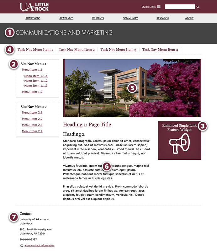
1. Page Header
The page header is the name of your unit, program, or department. A site administrator is the only one who can change the page header.
2. Site Navigation (also called menus)
Site navigation helps visitors find content on your site. Think of it as a table of contents (but you do not need to list every page in your menu). It is best to only provide two to six options per menu. Use familiar language that clearly describes what the links are. Group menu items in a way that makes sense to your visitors.
3. Sidebar Navigation
Use the sidebar section to add widgets and important links. You can use a sidebar widget to draw attention to an event, an alumni spotlight, a request form, etc. You can changes widgets periodically. However, menus stay consistent. It’s also fine if you choose not to use sidebar widgets.
4. Task Navigation
Task navigation is for links grouped by audience such as Future Students, Current Students, Alumni, etc. It is also for high-priority information on your site such as Degrees and Programs, Scholarships, Events, etc.
5. Featured Image
This image should have a resolution of 72 PPI. The size of a two-column width image should be 750 x 300 pixels. Blurry and pixelated images are not acceptable. All images on the page must have alt text for accessibility. Use this guide to learn how to place a featured image on your page.
6. Main Content Area
Use language that is familiar to your audience in your main content area. It should also support the university brand. Use appropriate paragraph styling. For example, only black text is allowed. Correct heading usage is also important for accessibility. Do not use headings for styling purposes. Each page must have a page title for accessibility and for search engine optimization (SEO).
In your body text, only use bold text to highlight urgent or crucial information, such as deadlines. Overusing bold text can make webpage content more difficult to read.
The page structure information is included in this WordPress guide you can download.