“Every day, we create 2.5 quintillion bytes of data. To put that into perspective, 90 percent of the data in the world today has been created in the past two years alone…”
– via study published by International Business Machines Corp.
Dr. Dirk Reiners has been an associate professor at UA Little Rock since 2014. Information Visualization is one of four courses that he teaches with the Department of Information Science in the College of Engineering and Information Technology.
What does the Information Visualization course cover?
D: How do I turn data into a picture that helps people to better understand the data? How do people see? What are the things that they actually see? How does our brain interpret the images that we see? People might think that the eyes are cameras, but they’re not — totally not. They work very differently, so a lot of things that our brains and eyes do automatically change how images are perceived; we talk about that and what influence that has on how you visualize data.
We also talk about how to lie with visualization, because if you make your pictures wrong, you can give people impressions about data that are just wrong. Once you go through the class, you will see that being used effectively on a daily basis, mostly by politicians, because they really like to present things that are not quite right, but that look good.
The bulk of the class is about methods on how to visualize data. What are the different ways that we can present data in a visual form that helps people analyze and understand it better, and hopefully remember it better? And there’s different targets for visualization – and typical problems are that you have too much data, and not enough screen space … and how can we visually present data in a small space? There’s many different methods that go beyond the simple bar charts and line charts. We talk about those too. They have their place, but there’s a lot beyond that on how to visualize networks – how to visualize trees – sort of hierarchical structures, like an organization diagram – like directors, CEO’s, CTO’s, and down to all the little people. There’s a lot of different ways on how to present those hierarchical structures that are much more effective than others.
We also talk about different visual elements – what kind of visual elements makes sense – does it make sense to use colors for values between 1-100? The answer is no, because our eyes don’t work like that. It makes sense to use brightness. It makes sense to use color intensity, but the sort of typical red, green, blue rainbows are very bad for that… we’re gonna talk about that and many other things – on how to really turn information into visual elements that make sense – that people can actually understand.
What sort of data do students work with?
D: My goal whenever I do these classes that are project based – like the main work, besides some minor homework, is a project. So the goal is for the students at the end of the semester to have a project where they present some data that they are interested in, that they identified themselves. I give them sources. Fortunately there’s a lot of data publicly available now. The US government, the city of Little Rock, the state of Arkansas, and the United Nations – they all have data portals. Everybody. It’s a big trend in public administration in the last couple years is a data portal, so you can download all kinds of data – crime data, traffic violation data. You can find a lot of data online.
I really encourage people to pick their own data so that they do something that they are interested in. In many cases, if we work with graduate students, they already have a research project that generates data that motivates them to be in the course in the first place, and they can use that. I’m perfectly fine with them using whatever data makes sense – as long as in the end, they have a coherent visual presentation that shows something interesting about the data, and usually people realize that it’s very easy to get a lot of data, and most of it is pretty important, but there are always some surprises – and that’s what we’re looking for.
Any memorable or fun projects?
D: I don’t know if I would call it fun. The project that I remember – For some reason, the last time I taught the course, there were a lot of people interested in jail data. There was some discussion about jails, and some fairly interesting analysis on the distribution of jail times, and one of the students was very interested in the death penalty – so some good information, and some good visualization about which states have it, which states don’t have it, and how long are people on death row … not quite fun – a little more morbid.
There was a fun one. One of the students did a fairly interesting analysis about game data – how popular certain games are, how long the popularity lasts for the different systems, and the different kinds of games – different genres of games, so that was pretty interesting.
What sorts of students take the course?
D: We have a pretty wild mix. Because of the required course in information science, that’s the bulk, but we do have business information people – a little bit of everything. There’s usually a few computer science people, but all of the disciplines are welcome – so we have geologists, nursing, and some other faculties that I wouldn’t expect, but nowadays everybody has data, and pretty much every graduate student has some kind of data that they need to think about, and the course is fairly open to pretty much anybody who wants to know how to turn data into pictures.
What are some obstacles a student might encounter?
D: There is a lot of data sources, but typically the data is not always clean, so you need to spend a little bit of time trying to figure out how to clean it up, or how to turn it into something that the visualization tools can handle. Most of the students end up using a visualization tool called Tableau. That’s sort of the 800lb gorilla in the information visualization world. A lot of companies use it because for universities it’s free. It’s online, and it can handle a large amount of data.
The trick is trying to figure out how to make Tableau look interesting, because everybody has seen 100,000 line charts with blue, green, and yellow lines – so trying to find visual ways that are interesting, and really show what’s interesting. People are surprised that it takes a little longer than expected, and more tries. It’s a very iterative process. You try something and see if you get some interesting results, and if not, you try another way to look at the data. Typically it’s not a ‘I load the data, I press a button, and then I’m done’ thing. It’s really an explorative process, which is the goal of the class – to explore and to find new ways to visualize your information.
Favorite part about teaching the course?
D: It’s always interesting to see what kind of projects people come up with. As I said, I don’t really give any limits. Some of them are challenging, but most of them have turned out pretty well. My favorite lecture that I do is the one where we talk about perception and optical illusion. Those are really fun.
Advice for students interested in taking the class?
D: If you have a class that’s project based, start working on day one, and don’t wait until the last three weeks of the semester. I see that too often, and the results are always bad – that’s the nice thing about a project class – you can start at the beginning of the semester. Your first attempt is probably going to be pretty bad. That’s the point. You need to learn and see how you can make it better.
Examples of Data Visualization
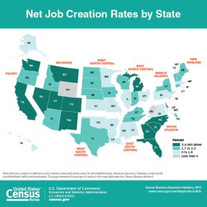
Maps
 |
 |
 |
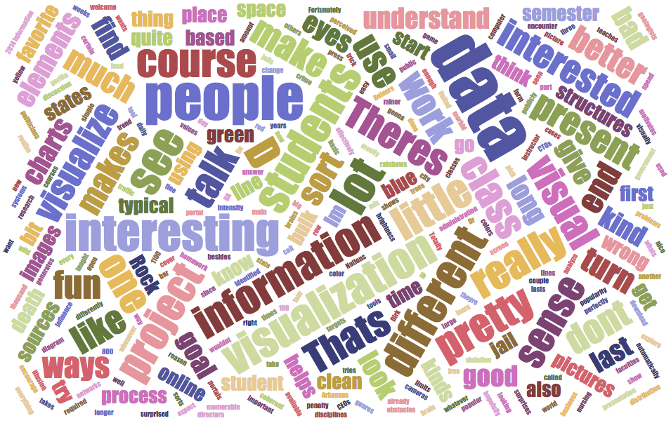
Word Cloud
This visualization was created using data from this article on a word cloud generator via jasondavies.com/wordcloud/.